Stay off the list of Ugly Belgian Websites? With 8 tips for a beautiful website!
Everyone's taste is different, which is why websites come in so many colours and forms. And that is definitely a good thing, because otherwise the Internet would be an extremely boring place. This diversity is fully reflected in the Ugly Belgian Websites. But for those who would still like some guidance to design their website 'by the book', we have put together a few helpful tips!
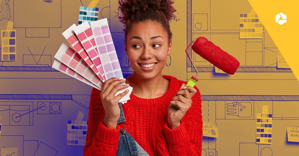
A website is like a business card: you want it to make a clear and professional impression on potential customers of your company. And, most importantly, you want people to notice it. If your website has been nominated as one of the Ugly Belgian Websites, you have already succeeded in the latter 😉!
Ugly Belgian Websites?
As Belgium's largest hosting provider, we at Combell have already seen many websites using our hosting services. Some of them being more… erm… beautiful than the rest. Of course, 'beautiful' is always a subjective concept: what you consider to be the Mona Lisa of websites may look absolutely horrible to someone else.
Fortunately, there are a few basic rules for creating a proper website. Having more than 20 years of experience, we can give you the best possible advice for a successful website. Now, let's get started!
1. Do you have a logo? Use it extensively!
The logo of your company is what catches the eye of most visitors. So make sure to keep the style of that logo on your website as well! Is your logo based on a particular font? Then you can also use that same font for certain titles or important sections of your website.
You should also consider the colours of that logo. For example, we recommend using the colour scheme of your logo on your website. This will help create more recognisability and uniformity. And with a bit of luck, potential customers will immediately think of your company when they see the same colours elsewhere 😉.
Surf on the website of big companies: in most cases you will see that the design of their website matches their logo!
2. Match the colours of your website
If you want to create a nice-looking website, make sure you spend some time making sketches beforehand. As mentioned above, one of the most striking elements is the colour palette of your site. If you do not have a (colourful) logo, you will have to create your own colour palette.
Make sure that the colours of your website do not clash with each other. You can do this by creating a colour scheme, i.e. a set of matching colours.
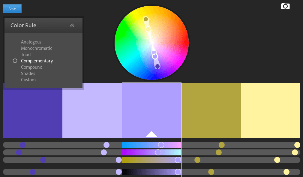
There are different types of colour schemes, which you can select on the colour wheel. You can e.g. project a feeling of tranquillity and balance with a monochrome colour scheme. In that case, you choose only one colour, with lighter and darker variations of it (simply moving from the outer edge of the colour wheel to the inner one).
Would you rather go for a somewhat more stimulating approach? Then choose a complementary colour scheme. With this, you go for hues that are directly opposite each other in the colour wheel. They will contrast strongly with each other, but they will certainly look good together, which will result in a playful and vibrant website.
You should also take a moment to think about the background of your website. Make sure it matches your colour scheme and provides adequate contrast with your text. For example, dark text on a dark background is very difficult to read, just like light text on a light background. So you better take that into account when creating your corporate identity.
You may think: does it really have to be so standardised? Not at all! If you want to highlight something, or make your specific brand look flashy, it is perfectly possible to go for clashing colours. Just look at the website of Ugly Belgian Websites 😉. However, make sure you do not overdo it with bold choices: that can be tiring for the eyes of your visitors.
Key tip
The Adobe Color Wheel will help you create a colour scheme in no time at all. On the left, you just have to select the type of scheme that you want (like monochrome or complementary), and then drag the colours that you want with your cursor. This way, you can immediately see what a good combination looks like. Very handy!
3. Choose pictures that reflect your image
Now that you have picked your colours, it is also time to decide which images you are going to use. Once again, the rule of thumb here is: uniformity!
Avoid using randomly chosen images. Instead, try to adopt a clearly defined style that perfectly reflects the message you want to convey. Do you want your business to give an impression of professionalism? Then you should definitely refrain from using cartoons or 'funny' pictures. Would you prefer to give a cheerful or light-hearted impression? Then feel free to go for pictures with bright colours.
You can opt for paid pictures or search for free ones on Google. However, be careful: not every image can be used for commercial purposes without permission!
Key tip
On Pixabay, you can download thousands of pictures that you can use for free on your website.
4. Go for a clear structure with different pages
Wandering around in a maze can be a lot of fun, but visitors to your website still need a clear path to find their way around it.
Make sure you create a clear structure for your website. Most websites have a 'homepage', which is the first page your visitors will land on when they enter your address.
But of course, you also want to advertise whatever products or services you offer. And that can be done on a separate product page.
Another important thing is to create a contact page so that your visitors can contact you via e-mail or using a contact form.
To make sure your visitors know who you are, you should also create an 'About Us' page. There, you can briefly explain who you are, your personal story and why you are so unique 😉.
In addition, you can always add a blog page: this will help you keep your customers informed about new developments within your company.
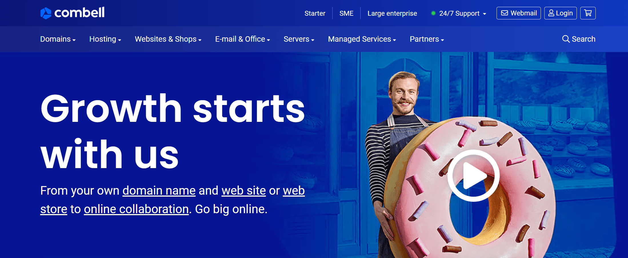
On the Combell website, you can easily navigate through our different pages thanks to our header at the top
By the way, make sure all pages are easy to find. Usually, 'buttons' pointing to those pages will appear at the top of your website. That will make it much easier for users to navigate through your website!
5. Go easy on the bells and whistles and keep things clear
Make sure your website is clearly laid out. You can achieve this by creating different pages (as explained above), but it is also important that visitors can have a clear overview on each page.
For example, leave enough white space. That means leaving enough space between the various elements (text, pictures, videos, etc.) of your page. This will help your visitor to carefully focus on the message you want to convey.
When it comes to clarity, always remember that less is more. For example, when you offer products, you should not place them all next to or below each other. Instead, you can highlight just one product, and then add links to the various product categories. Now that is clear!
Also, make sure you do not stuff your pages with all kinds of GIFs or funny gadgets. You should also absolutely avoid using 'marquees' (i.e. texts that 'scroll' over an image).

6. A readable font is essential
The font is very important if you want your website to look good. Once again, our advice is this: think about which font is best suited to your website (and business).
While you may really like Comic Sans MS, that font will always come across as awkward. We're just saying... This will undoubtedly put off potential customers.
Once more, as you probably guessed, we strongly recommend going for uniformity! A mishmash of different styles and fonts will not make anyone happy. Plus, it makes it very tiring to keep your head in the game. So make sure to keep the number of fonts you use to a minimum.

Ideally, go for a sans-serif font, which has no little dashes at the end of the letters.
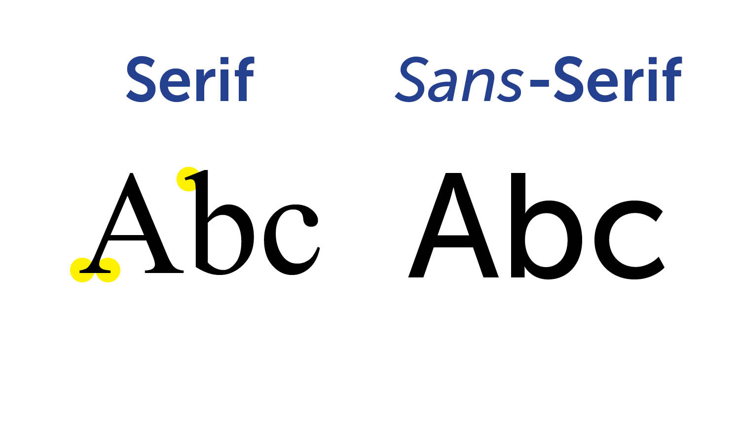
Sans-serif fonts are usually used for digital media (websites, etc.).
Do you want to convey a more professional image? Then you can still go for a serif font. Such a font exudes authority or expertise.
7. Make your website responsive
Nowadays, an increasing number of people visit websites using their mobile devices. So, if you want your website to be displayed correctly on a smartphone or tablet, you better make it responsive. That means that your website will adapt itself to the device your visitor is using to visit it.
Most website builders (such as WordPress or SiteBuilder) automatically create a responsive website, so you do not have to spend time on this yourself.
8. Go for a clear message
'Clear' is perhaps the key term in this article. And rightly so: this is how you ensure that (potential) customers know exactly who you are, why they have landed on your website and how to navigate through it.
The best way to point your customers in the right direction on your website is to use call to actions. These can be simple buttons or links with text such as 'Click here to discover our range'. That way, your visitor knows exactly where to go 😉.
And after all, those who know their way around your website are more likely to stick around. We are pretty sure you too would prefer to go to a shop where you can easily find all the products, right? Conversely, a junk shop where you have to dig to find what you are looking for will certainly come across as cheap. It is no different with your website!
This eighth tip will not so much help you make your website look more beautiful, but it will ensure attractiveness and clarity. And that is key to a great website, obviously.
Want to get your beautiful website online without any trouble? Come to Combell!
Now that you have all the tips you need to make a great website, all you need to do is get down to business. And we recommend you do that with the help of a reliable hosting provider!
Because if you want to get your website online, you will need three things.
- Your domain name: that is the web address of your website.
- A website: you can build it using a CMS such as WordPress or a user-friendly website builder like SiteBuilder.
- Hosting: that is the webspace where your website is hosted.
Combell is the Belgian market leader in hosting. With us, you can always count on fast, secure and reliable hosting. This means you can be sure that your website will stay online!
Do you need help building a proper website?
Our SiteBuilder is the best tool you can use to create a website without any difficulty. It is an online tool, which is very easy to use.
For your web design, you can choose from hundreds of templates, which you can fully customise to your taste. SiteBuilder also makes sure your website can be easily found by search engines such as Google, and comes with a wide array of handy tools – definitely ideal for building a successful website!