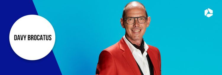
Here is why the Davy Brocatus website was the ultimate Ugly Belgian website
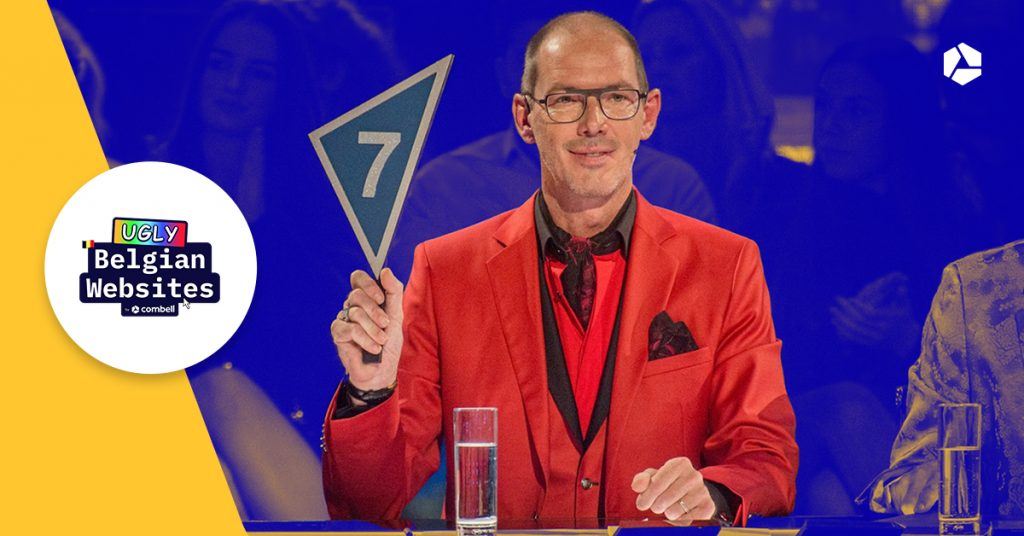
We at Combell recently went looking for Ugly Belgian Websites. In the end, our five-member jury, led by Ugly Belgian Houses founder Hannes Coudenys, rewarded the website of professional dancer and media personality Davy Brocatus with first place. Or last – your choice. But why exactly did davybrocatus.be score the least points?
You can also read:
When Davy judges performers in a dance competition, he probably gives points on the participants' graceful poise and polished footwork. As for the judges of the Ugly Belgian Websites (find out who they were here), they gave their scores based on design and usability.
And that is why Davy's personal website scored the fewest points. It is a delightful mess with much but at the same time nothing to find on it. Fortunately, there is some good news for former 'Dancing with the Stars' judge, as Davy won a complete redesign donated by Combell, including ten years of free hosting and all the extras that come with the registration of his domain name!
Discover below what makes davybrocatus.be an Ugly Belgian Website and what components Combell takes care of.
The unclear message from Davy's website
Davy Brocatus is a dancer with a bubbly personality, but apart from the far too flashy design, this was not at all reflected on Davy's website. So the whole point was lost to its visitors. So what message does Davy really want to convey?
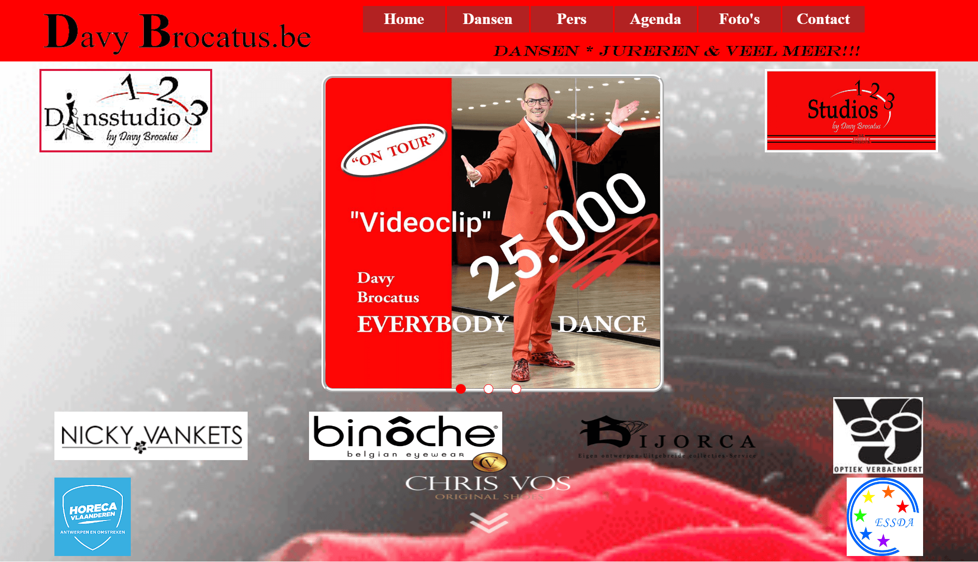
A good website should make you understand what it is all about. However, Davy took that a little too literally and crammed the key content into an ever-spinning carousel. And such carousels would be best left at a fairground. Because it does not help you find out what the website is about and where you can click to get more information.
The lack of security on Davy's website
Anyone visiting a website wants to feel safe. After all, cybercriminals are always on the lookout for your data. The only thing Davy wants to steal is your heart, but his website suggests otherwise. If you try to access the http:// version of his website, your address bar will instantly display a security warning. And that is a real shame, because https and the associated padlock are the main ways to show your visitors that your website is safe and can be trusted.
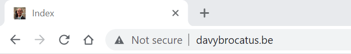
However, Davy has (cleverly) opted for an SSL certificate. But you should not forget to direct your visitors to that secure version. Are you experiencing the same problem? If so, feel free to contact us and Combell will take care of the rest.
You can also read:
The lack of security combined with the unprofessional look of Davy's website make you want to leave. Because you will inevitably start wondering whether this is really Davy's website, leaving you reluctant to book a dance class or a suite at his B&B.
Davybrocatus.be is definitely not mobile friendly
If you want to visit Davy's current website, you better not do so using your smartphone. Because his website is not mobile friendly at all. Davy is very mobile when it comes to dancing, though. So this is a missed opportunity, considering that most visitors will access your website using their mobile phone or tablet. In this respect, the judges of Ugly Belgian Websites were ruthless to the famous dancer. Mobile-first is a must!

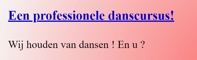
Chaotic design
Davy Brocatus likes to pull out all the stops with his garish outfits, but when designing your website, you better opt for a 'less is more' approach. Unfortunately, his online 'business card' looks quite amateurish.
For instance, there is no line in the design. Animations, fonts, colours... Nothing ever sticks to the same idea. The only constant is the use of red, Davy's well-known trademark. So red will also be used on the website that Combell will be redesigning soon, but obviously in a more balanced and smooth way. Just wait and see!

Davy's website shows the wrong photos
Brocatus goes to the most glamorous and hippest places. Too bad there are no photos showing that on his website. Because that is what visitors want to see when they visit the website of a TV personality like Davy.
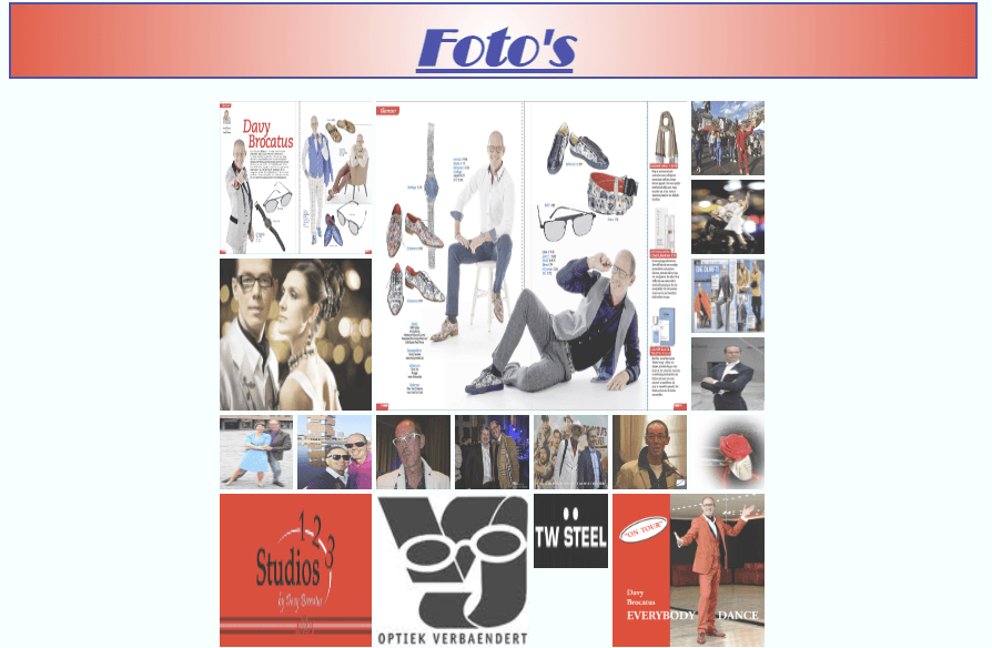
Instead, you end up looking at bland and also 'stretched' stock photos. And that is exactly how you give an impersonal impression. If you really have to use stock photos, at least make sure you choose relevant ones that fit your brand's style.
The lack of calls to action for Davy's visitors
Anyone with a website wants to highlight something online. And not just that. You want to encourage visitors to do business with you. You can achieve this by building your website in such a way that visitors are triggered, click through and consequently contact you (or even better: become a returning customer!)
Spoiler alert: that customer journey is completely missing from Davy's personal website.
Go-getters who want to contact Davy regardless end up reading content that has not been updated for a long while. They will even see Google+ still listed, even though that network is long dead and buried.
Some blue and underlined titles even look like links, when in fact they are not. Let this be a lesson to you: you have to take care of your website even after you launched it.
Conclusion: plenty of work ahead for Combell
Davy's website may be losing on all counts, but as the big winner of the Ugly Belgian Website contest, the Flemish dancer will be winning more than he ever dreamed of. Combell will ensure that his website undergoes one of the greatest makeovers in Internet Land. So brace yourself for a stunning before and after!
In the meantime, feel free to read our tips that will help your website stay off the Ugly Belgian Websites list.
Related posts