Four trends in front-end design from the Smashing Conference in Oxford
Lees in het Nederlands - Lisez en français
Blog post written by Michiel Van de Veire, web developer for Intelligent (the holding company that owns Combell)
As a web developer, I think it is necessary to keep up to date with the latest trends and techniques. To me, initiatives such as Smashing Magazine, Smashing Books and the Smashing Conferences are an ideal source of inspiration, because they focus exclusively on web design and front-end development.
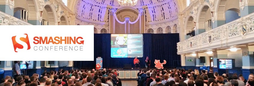
 Therefore, when I heard that a Smashing Conference was about to be held in Oxford, I have been very excited about going there. Since training is crucial to Combell, the company got me my tickets to the UK right away. Yippee!
Vitaly Friedman and the Smashing team organised two conference days where renowned speakers from around the world gave talks about pattern libraries, SVG, Flexbox, performance, HTTP/2, etc. In short, everything I am into!
Now, I would like to share these four trends, which I saw confirmed in Oxford, with you.
1. Responsive design remains important
 Responsive design (design that adapts to the device used to view it) is definitely still a hot topic, as I noticed in Oxford. When you hear responsive design, you think media queries, which are used as breakpoints to use CSS or not, but Vasilis van Gemert showed us that it is also possible to do without them. The smart use of floats, CSS columns, viewport units and flexbox (see 2nd trend) is often a much better solution.
Since we are busy making the Combell website responsive, these tips were definitely most useful. Vitaly Friedman also taught us many tricks. His presentation, fittingly entitled ‘Dirty front-end tricks’, was full of creative solutions.
“Beware: you will not be able to unlearn what you’ll learn in the session!” – Vitaly Friedman
2. Flexbox
 The increasing popularity of Flexbox is part of the previous trend. It is a CSS module. Flexbox was designed to efficiently create layouts that fully adapt to the user’s screen. In his talk, entitled “Taking layout to the next level”, Christopher Wright, front-end developer for Campaign Monitor, showed us the many possibilities of Flexbox.
“As web designers, we’re not designing around content, but rather we’re designing places for content to flow into.” – Mark Boulton
Flexbox includes countless new features, and I will definitely explore them all. The message Wright wanted to convey in his talk was very clear: experiment! Fail early, learn faster…
3. HTTP/2
The conference in Oxford also focused on HTTP/2, the new version of the HTTP protocol that is used for communication between a web browser and a server.
Patrick Hamann, senior engineer at the Financial Times, prepared us for the adoption of HTTP/2. The current HTTP1.1 protocol, which has been a standard since 1999 (and has remained unchanged since then), indeed needs an upgrade. And with good reason: HTTP1.1 only allows to load a limited quantity of data simultaneously (e.g. only six images at the same time).
 The great benefit of HTTP/2 is multiplexing. This technique makes it possible to bundle multiple http requests from the browser and send them to the web server. This results in a much smaller number of active connections, which allows for faster transfer of all the data. Pages will thus load faster, which is something end users always appreciate.
“HTTP/2 produces the biggest performance gains on mobile, because it remedies high latency.” – Patrick Hamann
As regards HTTP/2, our research is in a reasonably advanced stage. In a proof-of-concept mode, some of our servers can already support HTTP/2. Full integration for most of our hosting customers on our hosting cluster is expected later this year.
In Combell’s environment too, HTTP/2’s multiplexing capacity will allow to drastically reduce the number of concurrent connections. Multiplexing will also allow browsers to load content faster. And thanks to the server push principle, the client will be able to preload resources himself and set these resources’ priorities.
4. Living Design Systems
 As regards Design Systems, they are a new design trend. This approach allows for consistent design – cross-platform. Jina Bolton works for Salesforce UX and gave a presentation about it during the Smashing Conference.
“While a company is growing fast, there is nothing more important than constant communication and complete alignment.” – Mark Benioff
It is important, especially for larger projects or major brands, for the style and the style elements to remain consistent. Traditionally, a style guide was created for this, but it was rarely updated, which turned it into some kind of a “zombie” style guide.
A Design System, on the other hand, is a living product that makes it possible for the code of such a style guide to become dynamic. Based on this, all the members of a team eventually create within the same design. The Lightning Design System is an example that perfectly illustrates this approach.

In short, the Smashing Conference was very enlightening. The content of the talks was perfectly balanced, with interesting and useful front-end techniques and a lot of design knowledge. And the fact that this event was held in the beautiful city of Oxford, which is renowned for its University and Colleges, was of course a very nice added bonus!
I would like to thank both Smashing Magazine and Combell for this unique experience and the training session.
Related posts