Important: Making your website mobile-friendly

Are you visiting this blog post from your smartphone? It wouldn't surprise us. A whopping 95 percent of Belgians aged 16 to 74 surf the internet on mobile devices. So, it's best to ensure you have a mobile-friendly website. Because a poor user experience has significant consequences.
Why a mobile-friendly website is crucial
Making your website mobile-friendly. Why? Because your visitors expect nothing less. It's as simple as that. When you go online with your business, when you want your own website or online store...
The user experience of your target audience is crucial. Websites that don't function well, we all tend to avoid.
Wat is mobielvriendelijk?
A mobile-friendly website means that your website, app, or other digital platform is user-friendly on mobile devices. Primarily, this refers to smartphones and tablets. A site that is mobile-friendly can operate on small screens. To achieve this, you need to make optimizations to your site.
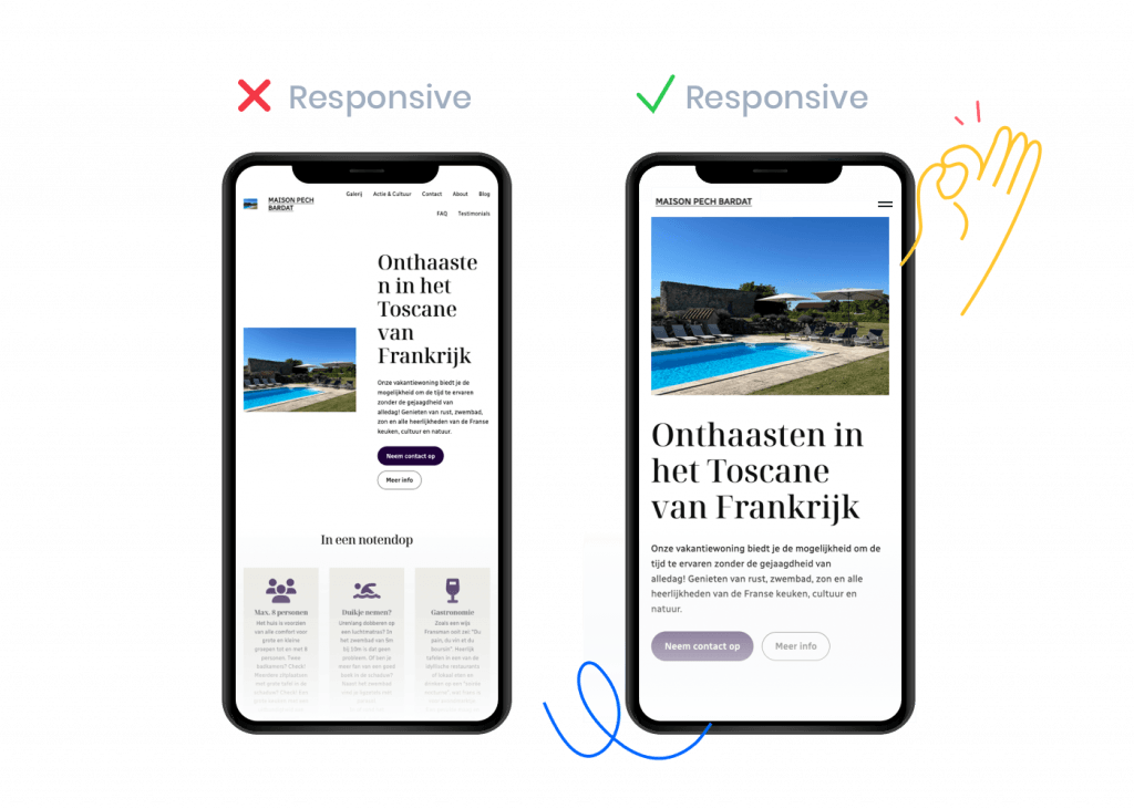
You may also hear the term 'responsive website'. This is not the same as being mobile-friendly. When you make your website responsive, you primarily focus on the design. Design, layout, images, text...
With a responsive design, everything is dynamically adjusted to work seamlessly on different screen sizes. Making your existing website suitable for mobile - being mobile-friendly - encompasses the whole picture. This includes factors such as loading speed and SEO rankings.
92 percent
Let's refer to the numbers from Deloitte once again. At least 92 percent of Belgians have a smartphone in their pocket. Among 18- to 24-year-olds, that percentage even rises to 97 percent.
It's therefore very logical that we see an increase in mobile internet traffic.
95 percent of Belgians aged 16 to 74 go online, and 92 percent of them do so on their smartphones.
Google's mobile-first indexing
Another reason to make your website compatible for mobile internet traffic: Google! Take it from us: if you're not found on Google, you're lost. If you want to make money with your website, it's very important to rank high on Google. And let the mobile-friendliness of your website be a crucial factor for that.

Our favorite search engine has introduced mobile-first indexing. Google's mobile-first indexing affects how Google indexes and ranks the content of your website in search results, with a focus on the mobile version of your site.
In the past, Google assessed the desktop version of your website to determine search results. With mobile-first indexing, that focus shifts to the mobile version, meaning Google prioritizes the mobile user experience when determining your ranking in search results.
Tips for good mobile-first indexing:
Making your website responsive and thus mobile-friendly is crucial for Google. An excellent user experience can help you achieve a better ranking in search results.
Ensure that your mobile-friendly website contains the same relevant and high-quality content as the desktop version. Avoid limiting content on mobile, as Google needs that content to assess relevance for search queries.
Check if structured data (schema markup) is consistent on both the desktop and mobile versions of your site.
Google likes it fast! So, optimal loading speed is essential. Optimize images, minimize CSS and JavaScript, and use browser caching to ensure that your mobile site loads quickly on mobile devices. More on this later!
You could opt for a mobile-first design when creating your new website. That means you first and foremost think about the mobile version of your site. Once that user experience is smooth, then you can work on the desktop version.
Making an existing website mobile-friendly
With the above tips, you're already scoring well on Google. Several of these tips also apply to the overall user experience of your website or online store.
Adapting your existing website for mobile is, therefore, a very smart idea. With a mobile website, you operate at a top level — crucial if you want to establish your business online.
Is my website mobile-friendly? Take the test!
Putting a mobile site online from the start is still the best plan. But if you currently have a website that is not or not yet completely mobile-friendly, you can still optimize your site. Because there's a solution for everything!
First, let's test the mobile-friendliness of your website. There are several ways to subject your site to a 'mobile-friendly test'.
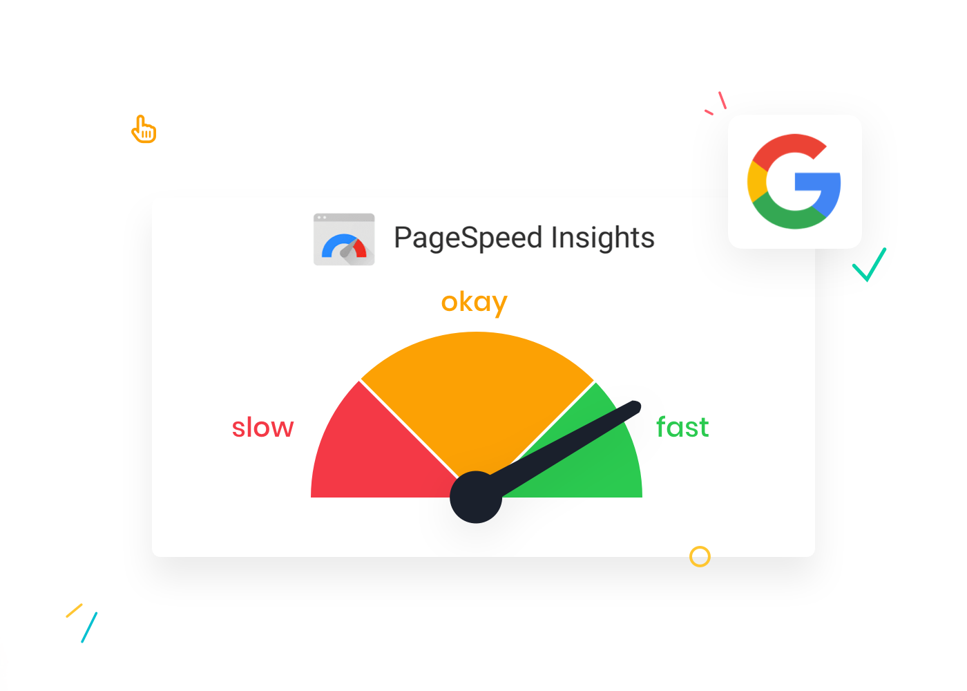
Our friends at Google are here to help again! With their tool PageSpeed Insights, you get an overview of how your website performs and what you can still improve. PageSpeed Insights also gives you an indication of the mobile-friendliness of your site.
Previously, you could also do the 'Mobile friendly test' from Google, but that application no longer exists.
This is a handy online tool that allows you to preview your website on different screen sizes. Responsinator simulates how your website looks on various devices, including smartphones and tablets.
You get a visual insight into how well your site performs on different screen sizes. If you write a lot of blog articles, you can check if your paragraphs are not too long.
While it's a paid tool, you get comprehensive reports on your website's performance in return. Additionally, SEO Site Checkup analyzes the mobile-friendliness of your website.
Afterward, you can work on implementing suggestions for improvements in design, loading speed, and other factors that impact the mobile user experience of your potential visitors.
Creating a Mobile Website with SiteBuilder or WordPress
Making your website mobile-friendly can be approached in various ways. Starting from scratch, optimizing your site, having a mobile website created by a professional agency or developer... The choice is yours.

But what if we told you that you can also create a mobile website yourself? This way, you save time and costs. You can also get your own website online much earlier.
Here at Combell, we have everything you need to make a good impression online. We want to go over two handy tools with you. Use them, try them out for yourself, and discover how easy it can be to build a mobile website!
Your mobile-friendly website with SiteBuilder
Our simple SiteBuilder is a website builder that allows you to create a responsive website without any experience or knowledge of code. How convenient is that? 😁
When you want to build your mobile website yourself, you can choose a SiteBuilder package with included hosting. With each SiteBuilder package, you can choose the size that's right for you!
Choosing the right web design
With SiteBuilder, you can immediately choose the right web design from over 100 templates and themes. This way, you ensure a graphical design that aligns with the image you want to create with your website.
Moreover, all themes are built to be mobile-friendly. The underlying code (which you don't have to worry about) is written so that the layout adapts to any device.
Tip
Both SiteBuilder and WordPress use AI technology. This means you have to do even less yourself. AI builds your website. The AI Site Assistant is included in certain Managed WordPress packages.
You can also choose from a whole library of free images. No hassle with copyrights, just drag and drop onto your website and you're done!
Your mobile-friendly website with WordPress
Feeling a bit tech-savvy and want to take it a step further? Then opt for a good CMS (Content Management System). A CMS is a system behind a website where you have control over things in the control panel.
You don't even need to know (almost) any HTML code yourself. The CMS provides a sort of text editor where you can format your page.
Tip
WordPress is by far the most popular Content Management System. Nearly 40% of all websites run on WordPress. That's why you can buy hosting packages at Combell where WordPress is pre-installed.
Using WordPress comes with many advantages. It's not only simple (free) Open Source Software, but you also have a choice of tens of thousands of responsive themes and plugins.
Many of these themes and plugins are free to install. They are all tools that make your website responsive.
Making your website mobile: practical tips!
The practical tips below will help you in making your site or shop mobile-friendly. This way, you'll know what to focus on and leave nothing to chance.
Are we repeating ourselves? Tough luck! 😀 Investing in responsive web design is too important, so we'll mention it again. Implementing a responsive framework and creating a responsive site is a crucial part of your mobile website. You can learn more about what responsive framework is and how to implement it on this website.

By literally and figuratively investing in responsive web design, you ensure that your website is visually appealing on different devices and that functionality and user experience are optimized, contributing to overall visitor satisfaction.
Let's not beat around the bush: you also bail out if a website is too slow. Looking something up or making a purchase on your smartphone while on the go... It needs to happen as quickly as possible. Every second counts on the internet. Time flies even faster on mobile!
So, lightning-fast loading speed is crucial for the mobile version of your website. It's a factor not to be underestimated.
Mobile users want instant access to your webshop or webpage. If it takes too long, they get frustrated and never come back.
Also, loading times are an important Google ranking factor. In other words, the faster, the higher. Additionally, potential customers stay longer on fast websites.
This means your website gets a lower bounce rate, which is a good thing. Because online, there's a lot of competition, and only the fast ones play at the highest level.
Onze supertip! Accelerated Mobile Pages (AMP)
One for the tech-savvy (or get someone to help you): Accelerated Mobile Pages (AMP). With this, web pages load even faster on various mobile devices. AMP pages are lighter web pages consisting of simplified HTML and CSS. Pages load almost instantly. It's a serious boost for your user experience.
AMP is often used for news articles, blogs, and other content-heavy pages to shorten loading times and improve accessibility on mobile devices.
Optimized images are an additional way to increase loading speeds. Reducing the file size of images results in faster loading times and an even better website experience.
Also, make sure that your images are responsive. That they scale along. An image larger than your screen looks very messy! Often, that's enough reason for visitors to give up.
Is your mobile website almost ready? Make sure your visitors don't lose their way. The action buttons - Calls To Action (CTAs) - are even more important on the mobile version of your site.

On a small screen, there is limited space, so your CTAs need to be well-placed and prominent. Therefore, it's a good idea to visually strengthen your Calls To Action and - quite literally, why not - underline them.
If your visitors don't know how to make a purchase on your website, you'll lose them. Then you'll miss out on income! So, make sure to have activating and eye-catching action buttons on your mobile-friendly site.
You can also implement optimizations on the SEO front that are important for mobile. Think about mobile keywords. You can use search terms and phrases that are often used by those surfing on mobile. Sometimes, these can differ significantly from so-called desktop keywords.
With 'mobile SEO,' the keywords need to be more specific and urgent. By strategically incorporating mobile keywords into your website, you improve the chance of being visible in search engine results and optimize the relevance of your site for mobile users. 😉
Example of mobile keywords
If you want to be found by mobile visitors, terms like 'restaurant' and 'lunch' are not specific enough. Mobile users often search for immediate solutions.
Mobile keywords such as 'restaurant Gent open now,' 'reserve lunch Gent,' and 'takeaway Gent' are much more effective. Your Google ranking will improve, and you'll get more traffic to your site.
It's time for your own mobile-friendly website!
What you've learned here, put it into practice. What do you think? 😁 Because it's clear: if you want to be online with your business, you need to do it with a mobile-friendly website.
Use our tools like SiteBuilder and WordPress web hosting to make those who visit your website on a small screen happy. If they, in turn, buy something from your mobile webshop, that makes you a happy entrepreneur. The circle is complete!
Related posts